Fahrenheit 2013
Project Analysis
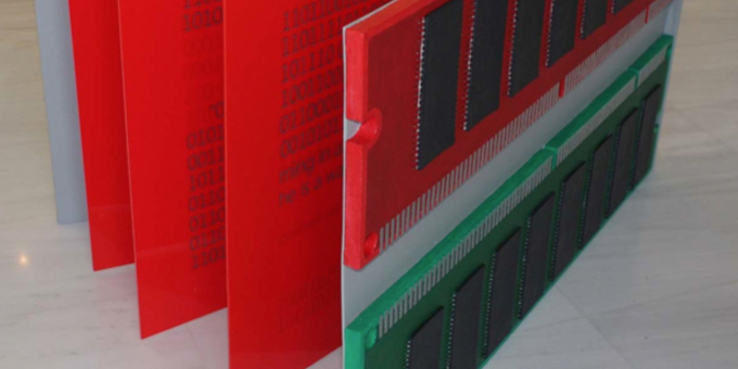
“Fahrenheit 2013” is an installation project inspired by the thoughts and beliefs I described above.
It consists of wooden trays, linen canvases, acrylic paints and inox metal parts. It depicts a surreal
form of a book – an album – which has been mutated into an “electronic” form, hence the virtual
computer memory parts on the back cover. The inner pages consist of fire’s red colored Plexiglas
sheets that have imprinted captions from the book of “Fahrenheit 451” in honor of Ray Bradbury, but
converted in a binary form, the speaking language of machines! Two opposed worlds, just like the
complementary colors – red and green – that constitute the whole project, which in contrast to the
position in the color circle, they have similar color values, showing existence problems when in
contact, and tend to erode each other in an even more tragic color clash.